Job Failures June 20-22: (Please try again)
The ACCRE support team introduced a security patch that caused an OS function to fail, and an obscure python error in the pipeline.
Workarounds have been installed in VUStruct. Please resubmit your variants. Thanks for your patience and understanding.
2026 May 07: VUStruct has been published!
Thanks for all the collaborators who made this possible. Please now cite: VUStruct: A compute pipeline for high throughput and personalized structural biology
If you have any difficulties using VUStruct, please Get in touch.Tutorial
Many tools have been developed to predict the effect of missense variants in the genome. VUStruct is provided to additionally analyze factors that are often excluded by other tools, such as thermodynamic destabilization of the resulting protein structure, 3D colocalization of the variant with clusters of pathogenic mutations in the same protein, potential digenic effects arising from pairwise interactions of variants in different genes, and other factors described below. For details about how the various methods work, please visit the Calculation Details menu above.
In this tutorial, we shall begin with an example list of variants of unknown significance (VUS) as input. These variants come from the sequencing results of a fictional case for diagnosis of an unknown disease. This tutorial will walk you through preparation and submission of the input data, and the interpretation of the results generated by the system.
A VUStruct case is launched from a single input file of candidate variants. Each case file typically includes 5-50 variants preselected from WES or WGS of the proband. This selection removes variants of unreliable quality, variants too common to be associated with the proband’s phenotype, variants associated with conditions unrelated to the patient’s condition, and known benign variants. In the UDN workflow, this step is usually performed by experts in clinical genetics, using standard software tools like VEP and databases of biomedical literature like OMIM.
vustruct.csv format
We denote VUStruct's ultimate input format as "vustruct.csv" and we provide a SampleCase file below and at the Launch page when the Demonstration default is selected. This flexible format allows not only entries of missense variants for generation of per-variant reports, but also gene names to additionally feed into the digenic disease predictors.
VCF format
Variant Call Format (VCF) is an excellent starting point for case runs from genomic coordinates. As shown in our sample.vcf below, we recommend a simple header, populated with tab-delimited minimal column set: CHROM, POS, REF, ALT.
VCF files are preprocessed to the vustruct.csv format described above. High and moderate impact variants in Uniprot Swiss curated transcripts are retained during preprocessing through the ENSEMBL Variant Effect Predictor (VEP)
The length of the input lists for this webserver is limited to 100 variants, because the ddG calculations are computationally intensive. But please contact us if you want to submit a larger set.
Submit only de-identified data. You will be given a link to access the results that is on the public internet, however difficult to guess.
Inheritance
Include inheritance information if you have it, following the vustruct.csv examples below. Typically the proband’s parents are included in the WES and WGS testing, to ascertain the inheritance of the variants, and match it with the segregation of the phenotype. Sometimes additional relatives are included, e.g. siblings who are affected or unaffected. If you are using VCF as your input source, you will have to manually add inheritance details to edit the generated vustruct.csv file after preprocessing, and submit a new case with this edited file as your starting point
We also have customized the pipeline to preprocessed specialized spreadsheet formats for Vanderbilt's and Washington University's UDN programs. We'd welcome the opportunity to explore automated conversion of your institution's case format
| index | gene | chrom | pos | change | effect | transcript | unp | refseq | mutation | genome | inheritance | zygosity |
|---|---|---|---|---|---|---|---|---|---|---|---|---|
| 1 | COA5 | chr2 | 98608380 | G/A | missense | ENST00000328709.8 | Q86WW8 | NM_001008215.2 | P9L | GRCh38 | father | heterozygous |
| 2 | NAGA | chr22 | 42067209 | C/T | missense | ENST00000396398.8;ENST00000402937.1;ENST00000403363.5 | P17050 | NM_000262.2 | D136N | GRCh38 | mother | heterozygous |
| 3 | SMYD5 | chr2 | 73218934 | C/A | missense | ENST00000389501.9 | Q6GMV2 | NM_006062.2 | A57E | GRCh38 | father | heterozygous |
| 4 | SMARCAL1 | chr2 | 216447069 | G/A | missense | ENST00000357276.9;ENST00000358207.9;ENST00000425815.6... | Q9NZC9 | NM_001127207.1 | A588T | GRCh38 | mother | heterozygous |
| 5 | ONECUT1 | chr15 | 52789080 | G/C | missense | ENST00000305901.7 | Q9UBC0 | NM_004498.2 | R269G | GRCh38 | father | heterozygous |
| 6 | ALAS2 | chrX | 55017645 | C/T | missense | ENST00000650242.1 | P22557-1 | NM_000032.4 | A282T | GRCh38 | mother | X-linked |
| 7 | ALAS2 | chrX | 55017645 | C/T | missense | ENST00000335854.8 | P22557-2 | NM_001037967.3 | A245T | GRCh38 | mother | X-linked |
| 8 | ALAS2 | chrX | 55017645 | C/T | missense | ENST00000396198.7 | P22557-4 | NM_001037968.3 | A269T | GRCh38 | mother | X-linked |
| 9 | AP3D1 | chr19 | 2115592 | C/T | missense | ENST00000345016.9 | O14617-1 | NM_003938.6 | V699M | GRCh38 | mother | heterozygous |
| 10 | AP3D1 | chr19 | 2115592 | C/T | missense | ENST00000643116.3 | O14617-5 | NM_001261826.1 | V699M | GRCh38 | mother | heterozygous |
| 11 | RTEL1 | chr20 | 63688301 | G/A | missense | ENST00000370018.7 | Q9NZ71-1 | NM_016434.3 | G546D | GRCh38 | mother | heterozygous |
| 12 | RTEL1 | chr20 | 63688301 | G/A | missense | ENST00000360203.11 | Q9NZ71-6 | NM_001283009.1 | G546D | GRCh38 | mother | heterozygous |
| 13 | RTEL1 | chr20 | 63688301 | G/A | missense | ENST00000508582.7 | Q9NZ71-7 | NM_032957.4 | G570D | GRCh38 | mother | heterozygous |
| 14 | RTEL1 | chr20 | 63688301 | G/A | missense | ENST00000482936.6 | Q9NZ71-8 | NA | G546D | GRCh38 | mother | heterozygous |
| 15 | RTEL1 | chr20 | 63688301 | G/A | missense | ENST00000318100.9 | Q9NZ71-9 | NM_001283010.1 | G323D | GRCh38 | mother | heterozygous |
| 16 | SORD | chr15 | 45069018 | CG/C | Frameshift deletion | Q00796-1 | NM_003104.6 | Frameshift deletion | GRCh38 | mother | homozygous | |
| 17 | SEC61A2 | chr10 | 12085047 | Deletion | Deletion | GRCh38 | de novo | heterozygous |
- Download SampleCase_vustruct.csv: Variants and Gene Names in Input variants and Gene Names (with inheritance information) in Vanderbilt UDN case spreadsheet format.
- VCF Example: Download SampleCase.vcf: The Genomic Coordinates of the variants in standard Variant Call Format
Go to the VUStruct launch page, which can be clicked from the menu at the top of this page. You will see an input form with a SUBMIT button at the bottom. Enter your Case Label in the top field and then select a Data Format of 'Demonstration VUStruct CSV'.
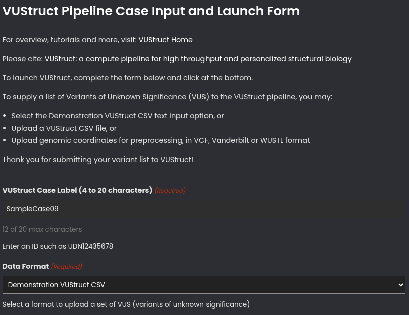
Then, enter an optional Email address if you wish to to receive progress reports. Otherwise, plan to retain a bookmark to the case report page.
To launch, click the blue/green button the bottom, 'Submit VUStruct Case to Computer Cluster'.

The duration of the calculation depends primarily on the size of the proteins. If the longest protein in your list is under 200 residues in length, the calculation can finish in as little as 4-6 hours. For proteins >1000 residues in length, the calculation can take more than 3 days to finish.
General
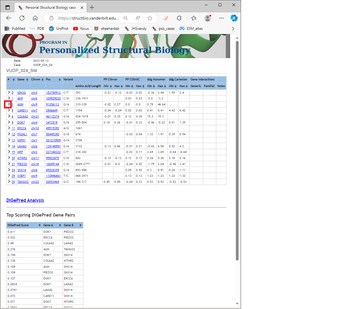
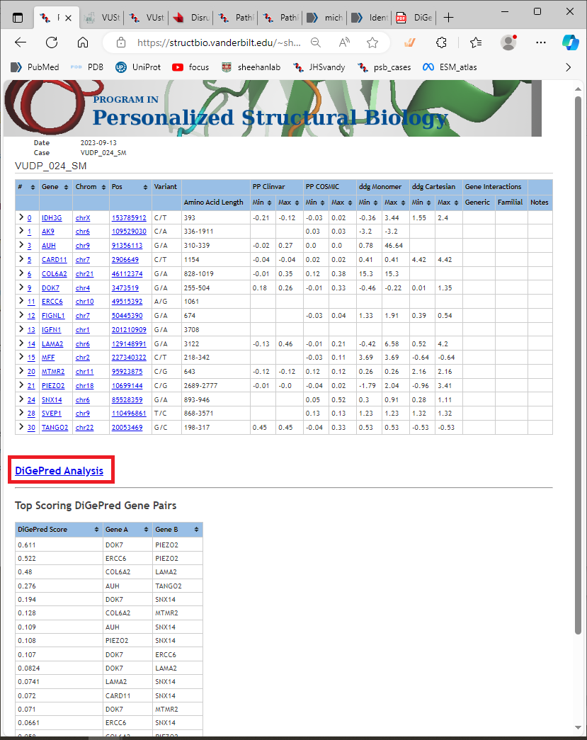
The results page for a calculation looks like this below. The top table shows a summary of the predictions for all variants submitted.The DiGePred predictions are shown in a heat map linked from “DiGePred Analysis,” and summarized in the lower table.
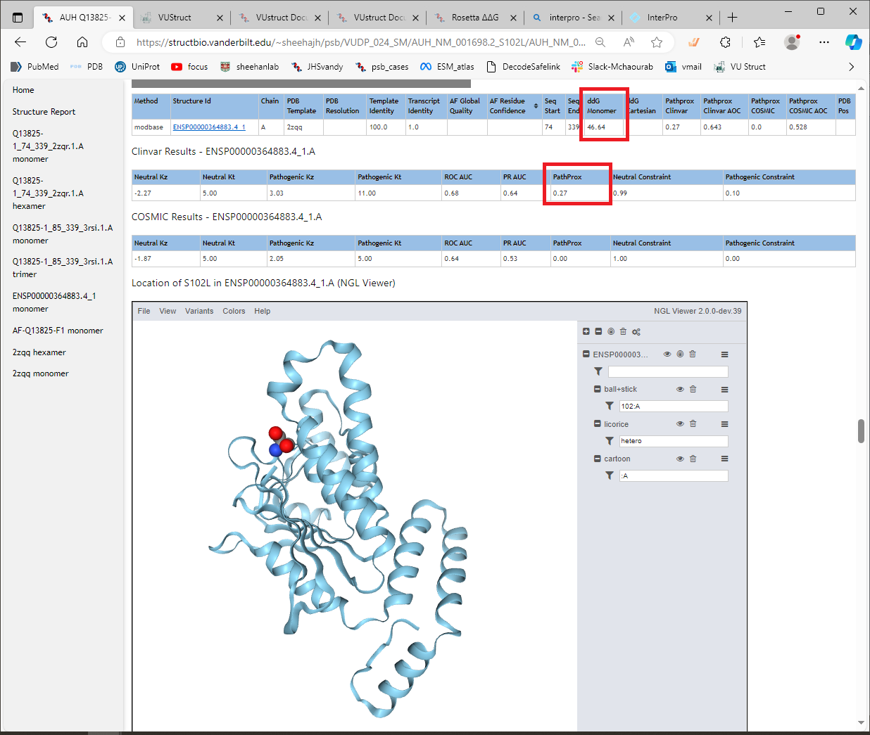
Each line in the top table shows the variant information, and a summary of the PathProx and ddG calculations. Note that the summary does not give a full picture of the predictions, because it combines calculations performed on multiple isoforms, and multiple structural models for each variant. You should look at each one in detail as shown below:
You should first expand the rows for each variant of interest by clicking on the “collapsable” icon (looks like a greater-than sign) at the left of each row. Example highlighted in red box here
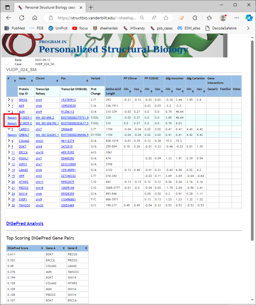
Once that row is expanded, you will see the links in the first column go to a “Report” for the variant as it appears in each curated transcript (and corresponding protein isoform). Example highlighted in red below [fig 05.png]. These are important links, because they will take you to the detailed prediction for the calculations. Again, you should not rely on the summary alone. Click on a “Report” link to see the results page for that variant.
Report Pages
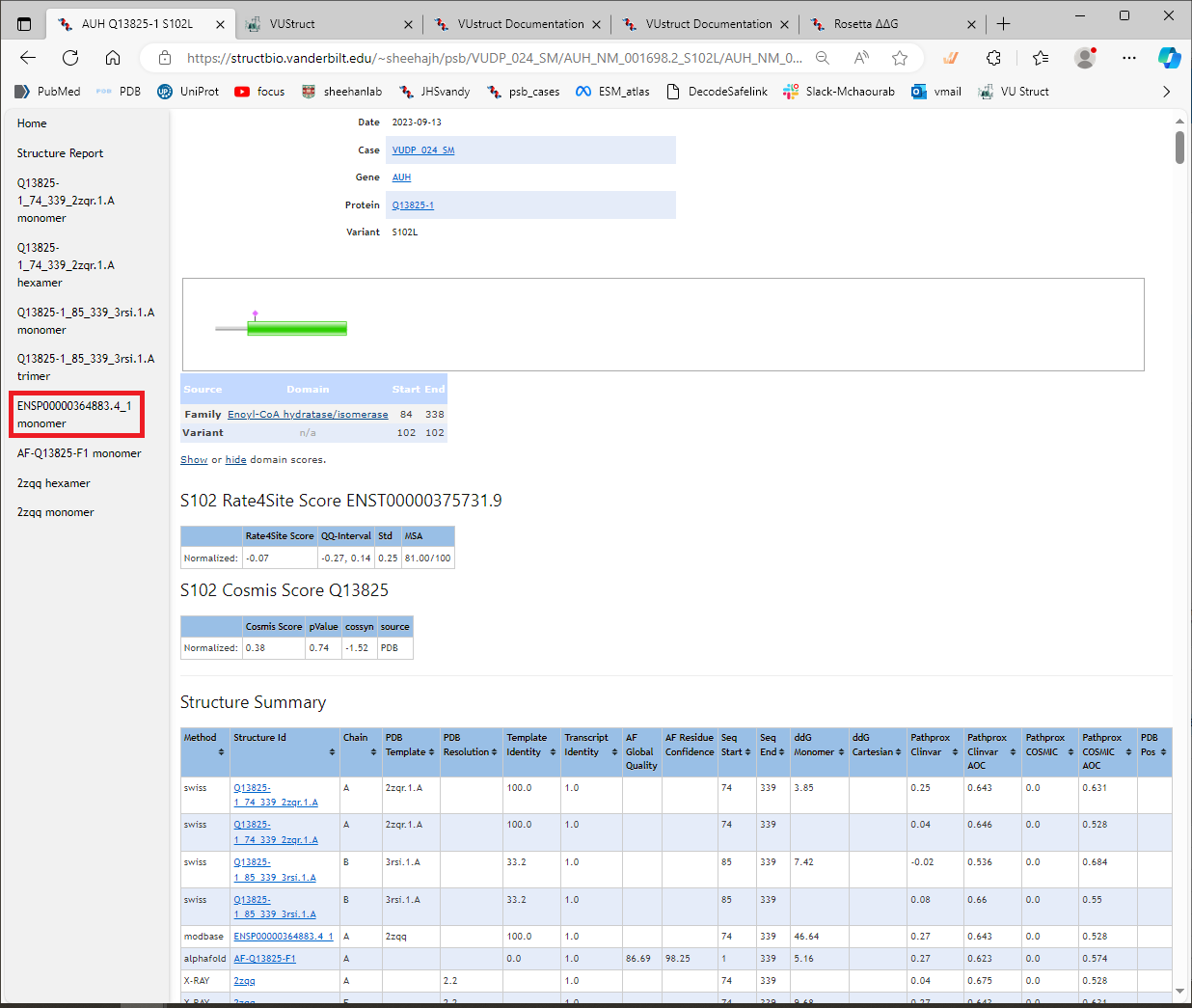
Each Report link will take you to another page that is specific for that variant in one transcript/protein isoform. The calculations can be performed multiple times, depending on how many structural models are available for the protein (which include the variant position). An example Report page is shown below. Helpful features to note on this Report page are:
- Summary information at the top, including links back to the main “case” page, the gene information at Medline+, and the protein information at Uniprot.
- A graphical view of the protein sequence, with PFAM domains highlighted, and showing the location of the variant of interest. This quickly shows whether the variant falls in an annotated domain, between domains, or near the protein termini. This is a quick view; for greater detail, you can look at the Interpro site at EMBL-EBI.
- Rate4Site score for this position in the protein (for details, see the documentation page.)
- Cosmis score for this position in the protein (for details, see the documentation page.)
- Structure Summary table lists all structures used for the calculations. The PathProx and ddG calculations are run for each structure. There may be experimental structures from the PDB, including structures generated by X-ray crystallography, NMR solution spectroscopy, and CryoEM techniques. There also may be models gathered from the AlphaFold2 database (the names start with “AF-”). There may be models taken from ModBase at Salilab (the names start with the RefSeqID “ENSP…” ). And models from SWISS-MODEL repo at Expasy (the names start with the UniProt ID, e.g. Q13825). Some of these structures and models will contain the full-length protein, sometimes in multimeric states, others contain only domains or a fragment of the protein. The structures and models may vary widely in quality and relevance, so you will want to consider which one is the best for your purpose.
- The left margin contains shortcuts to the section of the page that contains the results for each structure listed in the Structure Summary table. Each section contains details of the PathProx and ddG calculations. To be clear: the links in the table take you to the source of each structural model, whereas the shortcuts in the left sidebar take you to the results of the calculations lower down on this page. Click on one of the shortcuts to go to that section. (Highlighted in red here.)
Example section for a structural model
Each section contains results for one of the structural models. The results include:
- PathProx calculations using variants from ClinVar as “Pathogenic”
- PathProx calculations using variants from COSMIC as “Pathogenic”
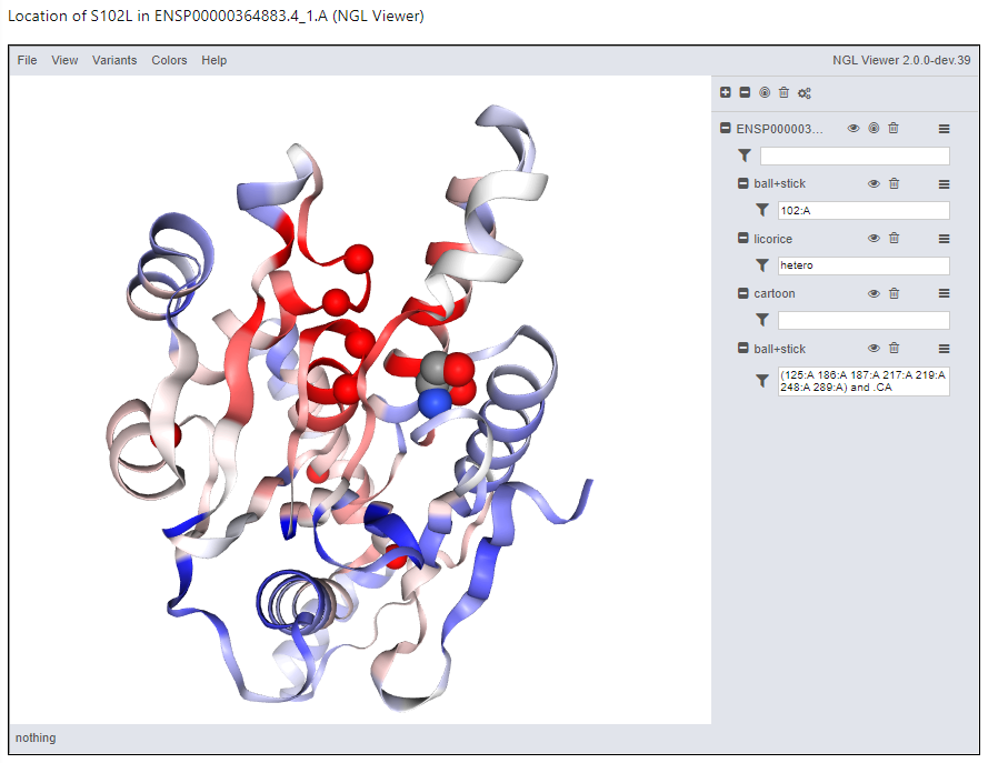
- a 3D display (using NGL viewer) of the variant in the structural context
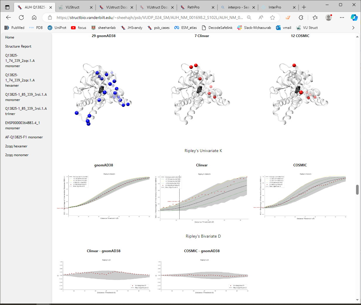
- and 14 thumbnails detailing the variant distributions and statistics for the PathProx calculations
Here are shown the results of calculations using the model from ModBase. [You can see that in this case, the ddG_monomer calculation gave a very high score, >46 kcal/mol, in contrast with the ddG_cartesian calculation which did not give a score.We launch both protocols because sometimes one of them fails to complete, due to problems such as e.g. chainbreaks in the input structure. Below that, the PathProx score of 0.27 is shown under “ClinVar Results,” which quantifies the colocalization of the variant compared to distributions of pathogenic vs benign variants (for details and references, see CalculationDetails->PathProx ).
Structure display
The variant is shown in the context of the structural model using NGL viewer. This provides great flexibility in displaying the data, even permitting you to save a figure. For example, use the menu option Variants → ClinVar to show the locations of the pathogenic variants. Then use Colors rarr; ClinVar PathProx to paint the ribbons with the corresponding scores at each residue. It becomes clear why this location scored highly, especially if you contrast that with the display of Variants rarr; GnomAD. You can save your figure with File → “Export Image”
Thumbnails of PathProx Statistics
The 3D viewer is followed by additional images showing the distributions of variants compared to the statistics of the null distribution used by PathProx
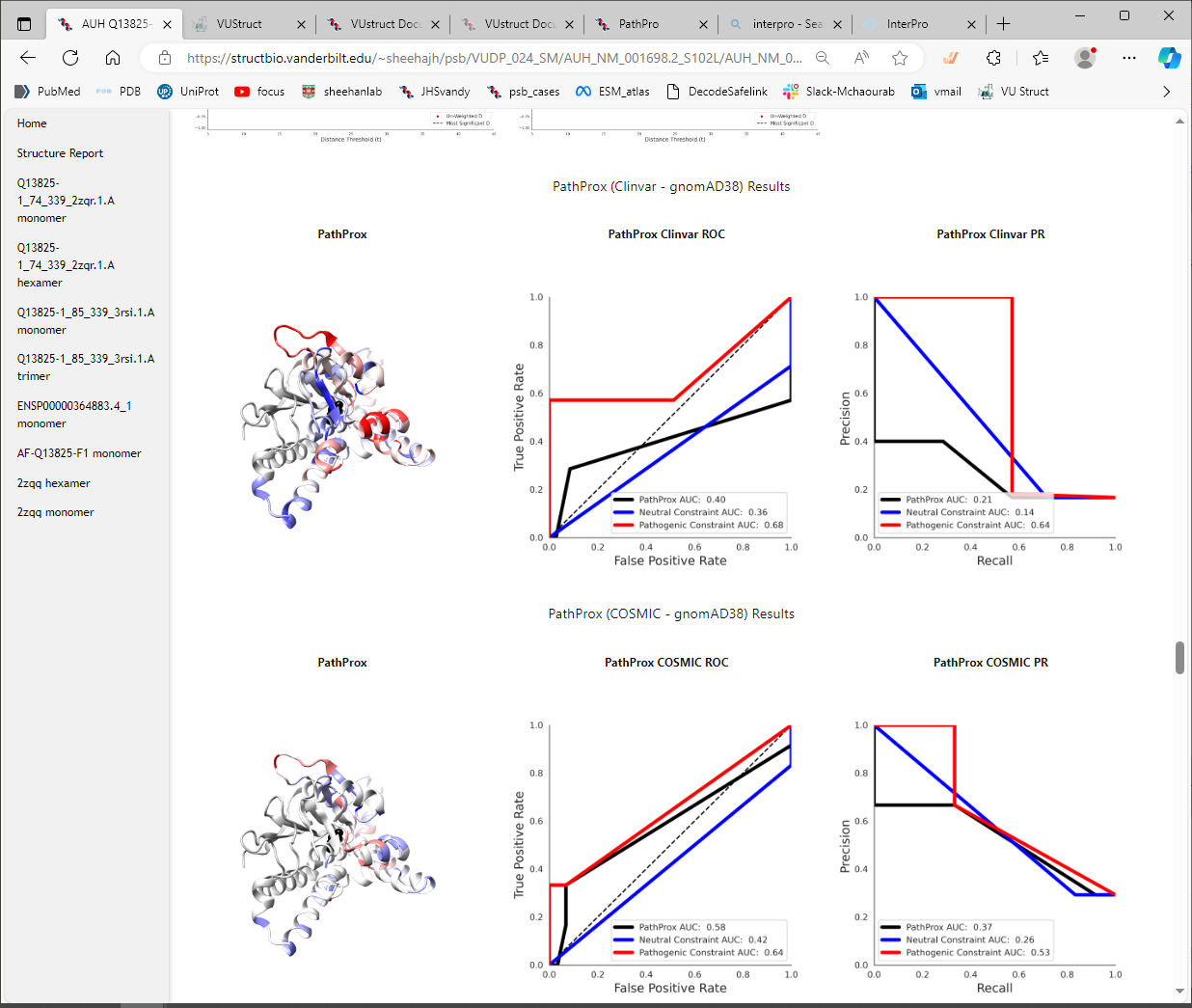
It can be useful to view the ROC curve and the PR curve for the PathProx calculations.
The score itself can be more or less convincing, depending on the number and distribution of the pathogenic
variants and the neutral variants. You can see in the PathProx Clinvar ROC below, that the classification
confidence is suggestive, but not overwhelmingly strong. Does that match your intuition from looking at the
distributions in the NGL viewer above? For a better understanding of spatial constraint, be sure to read
(Sively et al. 2018)
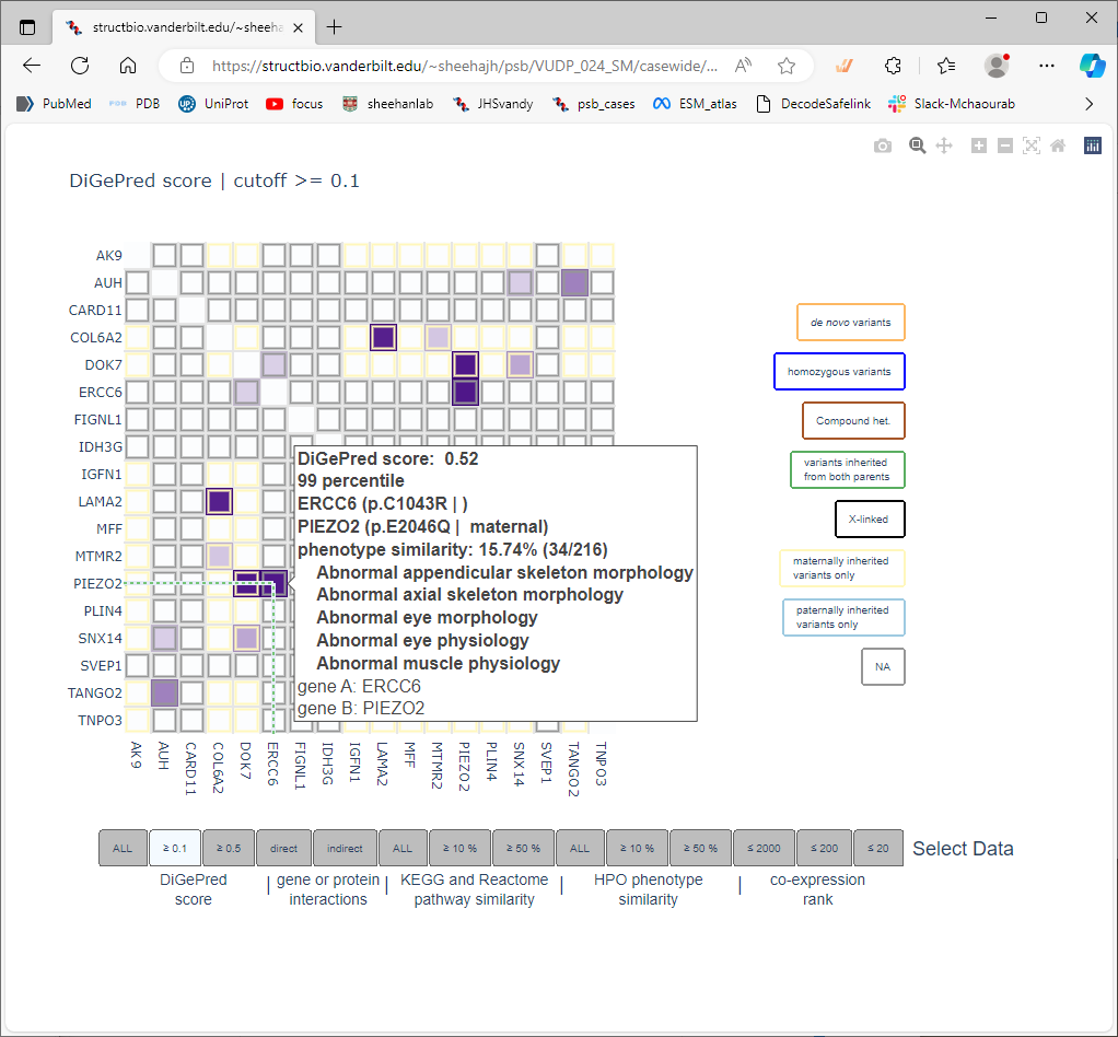
DiGePred results
The genes you provide in your list are evaluated for the potential of digenic disease interactions.
This is done using a predictor called DiGePred,
a random forest classifier for identifying candidate digenic disease gene pairs by features derived from
biological networks, genomics, evolutionary history, and functional annotations. Go back to the “case page”
that summarizes all the results for this VUStruct run. You’ll see a summary table of the DiGePred scores.
Just above that is the link to the detailed results (highlighted in red below):
The digenic predictions are displayed as a heat map. Each cell represents the potential interactions between two of the genes in the list. The matrix is symmetric (redundant). The legend on the right hand side indicates the colors that the cell borders will be drawn, used to highlight the inheritance information (if provided with the input data). The tabs at the bottom are used to select subsets of the information used as support for the predicted interactions, and change the display of the heatmap. Moving the mouse cursor over individual cells displays a pop-up tip that summarizes the score, and the information used to support that score.
Summary
Some of the results of these calculations are effectively orthogonal to the predictors most commonly used. We have found them useful for prioritizing candidates for additional investigation that are not clearly implicated by other methods. Summarizing the data is not trivial, so we create a spreadsheet highlighting our conclusions.